Unsere vernetzte Welt verstehen

Wie bedeutend sind personalisierte Suchergebnisse im Wahlkampf? Teil II
Für viele InternetnutzerInnen sind Suchmaschinen das Tor zur virtuellen Welt. Es ist nicht ungewöhnlich, sich dort über die Politik zu informieren. Doch inwiefern erhalten wir hier dieselben Ergebnisse? Während des Wahlkampfes scheint dies eine besondere Relevanz zu besitzen: Was passiert, wenn BürgerInnen sich auf Google verlassen, um Informationen über politische Parteien und deren Kandidaten zu erhalten?
Katharina Zweig: Analyseergebnisse
More on personalization in political Google results
In my previous post we explored the question of how similar the results of several Google searches for the same term are. If two different people search for Angela Merkel, what do they see, and in what respects do their results differ? I first presented some descriptive statistics on the shares of individual sites for users who are logged into a Google account and those who are not. We proceeded by looking at random samples of result sets for similar queries and assessed their similarity using the Jaccard index. While that seemed like a promising start, there is more we can do to investigate the relative similarity/diversity of search results rigorously. In this post, I want to work toward that goal by using further descriptive statistics along with conditional inference trees, a technique based on regression analysis.
I’ll start by describing some basic properties of our dataset and save the trees for the second part of this post. There is a compelling reason for this. The type of search data provided by Datenspende BTW17 can be used to look into two distinct issues: (1) How does Google present parties and candidates and (2) How strongly are results personalized when searching for parties and candidates. The first question is not our main interest in this post, but I want to show how the data has potential for approaching that issue as well as the second one.
How does Google present parties and candidates?
To make the results more broadly comparable, we coded the individual websites in the data into categories. Below are two graphs that show the share of these different website categories for each search term. The left graph shows the absolute number of results for each search term by category, the right one the relative percentage of the website types. Both graphs cover the eight weeks since Datenspende BTW 17 was launched (click to enlarge).
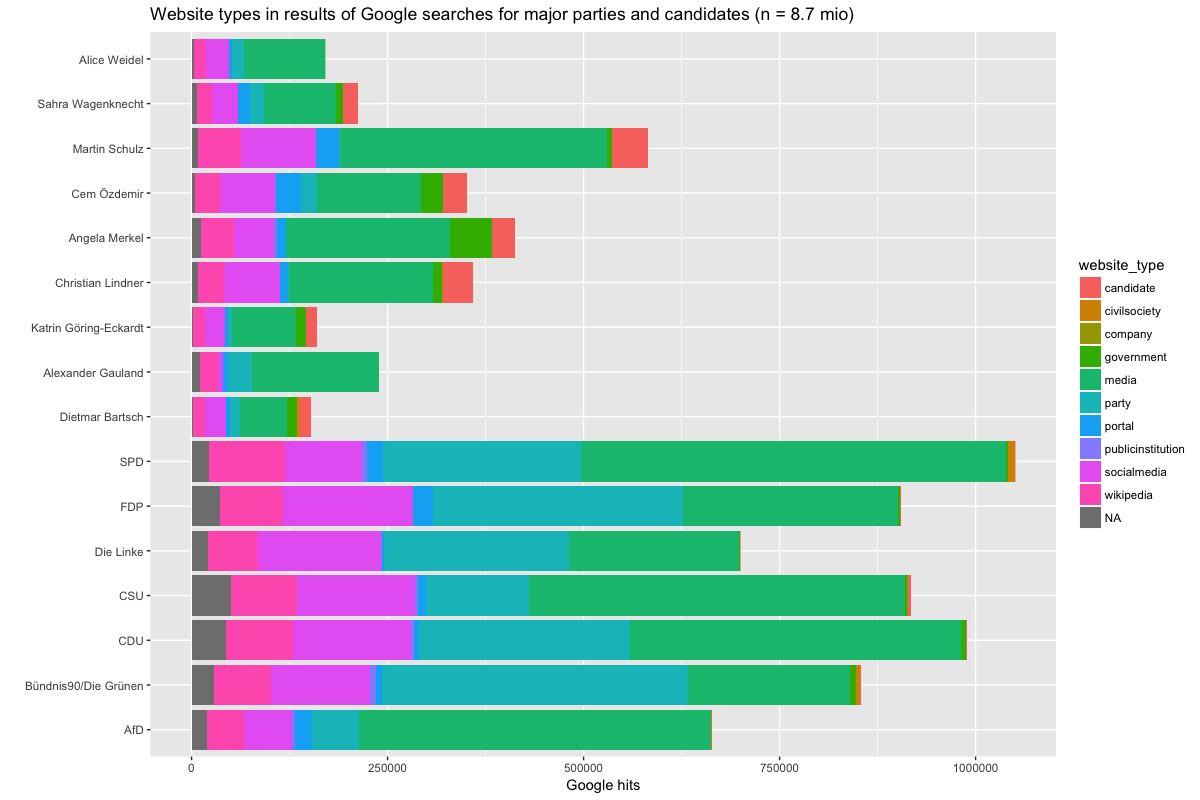
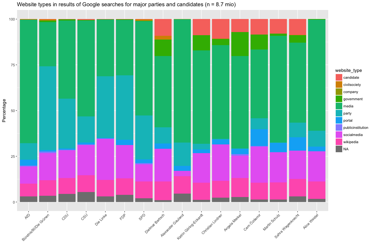
Why are there so many more results for Martin Schulz than Dietmar Bartsch? This may be related to random variation in the behavior of the search plugin. For example, the order in which the plugin will search may have an influence, with terms at the beginning of the sequence garnering more results than those further down the list. Users may interrupt the procedure, or other things may interfere, such as connection or server problems. The bottom line is that the difference in overall results should not be considered important, but their relative share (hence the second graph).
When examining these shares a few things stick out. For all queries, a large percentage of results are media sources (newspapers, broadcaster). This share ranges from 25-30% (Greens, FDP, Linke) to 60-70% (AfD, Gauland, Weidel). The category portal with sites such as t-online.de, web.de and gmx.net is related to this category, but distinct from it. This is hardly surprising — most information on political parties and candidates comes from news organizations — but the differences are somewhat interesting, given that political actors for the most part control their self-presentation on party and candidate websites, as well as on social media. Party websites differ greatly in their role, though that does not necessarily mean that their impact also differs (more on that later). While for the Greens party websites make up a whopping 40% of overall search results, it is less than 10% for the AfD. The difference can be explained by the degree to which local party branches communicate through their own website vs. their reliance on social media. Whereas the Greens with their overall young electorate have a penchant for setting up websites, the AfD is a minnow here, relying more on social media and especially Facebook, where the party page has received more Likes than all other parties (350.000+). Why is the share of social media-type results for the AfD still quite low? Other parties simply have more individual blogs, Twitter, Facebook and Instagram accounts, and YouTube channels, or at least Google indexes more of them. Die Linke in particular seems to show a penchant for social media.
Shifting to the candidates, the AfD also distinguished itself from the candidates of the other parties. Both Alexanders Gauland and Alice Weidel do not have candidate websites (or at least Google doesn’t show them) but instead are visible through social media (Weidel only, Gauland is abstinent from social media), the party’s website(*), Wikipedia, and (in particular) mass media. By contrast, the share of candidate websites of those candidates who have them is so steady that one wonders whether there might be a quota. While it is not clear whether the dominance of media sources in relation to the AfD is for a lack of party-run sources or the result of what Google assumes to be relevant content, the image of the AfD on Google is largely shaped by news sources, while for Die Linke, the Greens and the FDP in particular, the share of controlled sources is considerably higher. Finally, many of the candidates are also visible through involvement in government, whether on the national, state or municipal level. This share is fairly stable, as is the share of Wikipedia, for which we coded a separate category because of its outsized share of the total results.
The shares of different types of results can also be interrogated over time. The two graphs below show the respective shares of the different categories over the course of eight weeks since the Datenspende plugin was launched on July 5th. Note that this is for all queries combined, rather than individual ones. As before, the percentage shares (the right graph) are more relevant than the absolute figures (the left graph), since the latter obscure relative change as opposed to overall frequency (click to enlarge).
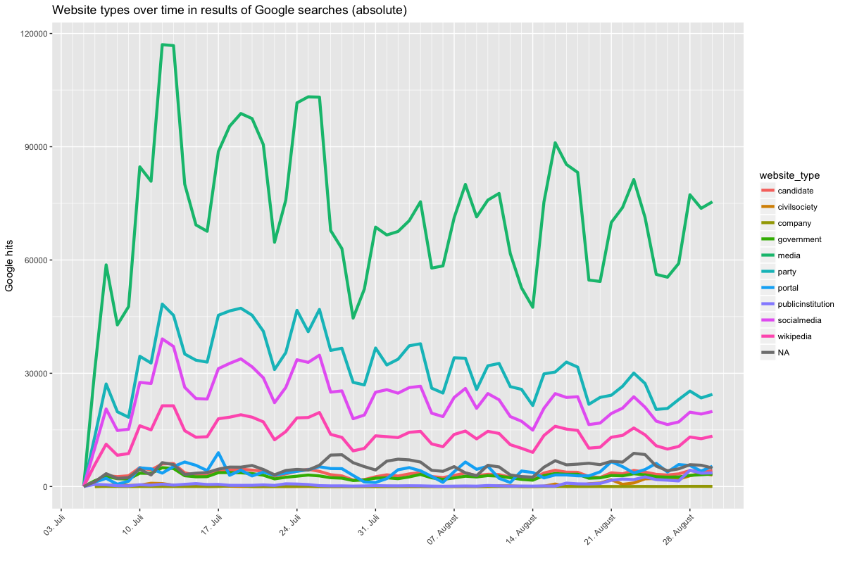
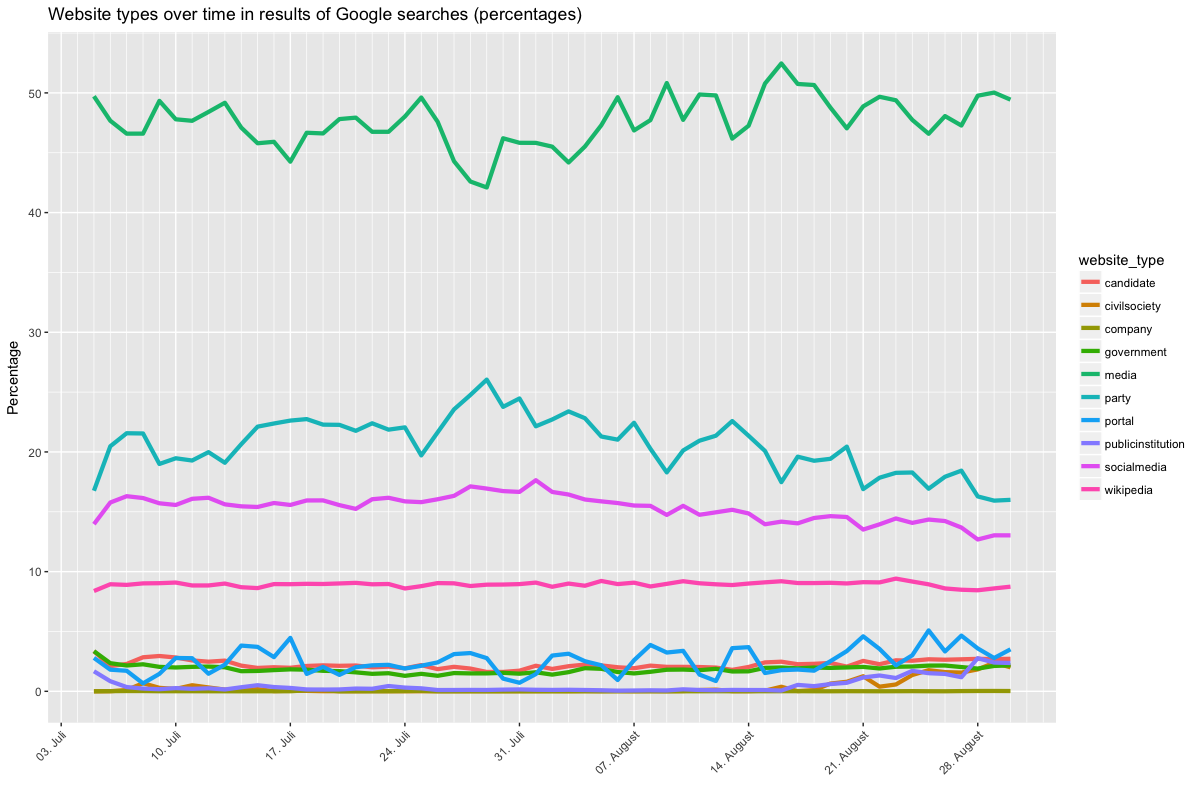
In the first graph you’ll notice a pronounced weekday-weekend split, which simply means that fewer people are running the plugin (and quite possibly their computer) on the weekend, which is hardly surprising. Media has the highest share throughout, followed by party pages, social media and Wikipedia, with all remaining categories trailing. If you examine the relative frequencies, actually trends (or lack thereof) can be more easily assessed. Wikipedia basically does not fluctuate, which is reassuring. Both the share of party pages and social media appears to decline slightly, though this may just be a hitch. The share of media-type results fluctuates according to the day of the week — on the weekend it declines more strongly than these shares of the other categories. The share of party pages increases on the weekend, though it is important to keep in mind that search activity on the weekend is generally lower. Still, perhaps there is a mobilization strategy somewhere in there? Of course political strategists know that there is less media coverage on the weekend, but it is perhaps interesting that portal sites such as t-online.de take over from news outlets on Saturday and Sunday.
Let’s look at four graphs that show the category shares for particular queries. Be sure to check the legend for the coloring, as it changes between figures 1/2 and 3/4, as does the scale of the y axis (sorry for that).
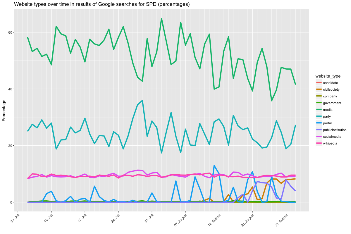
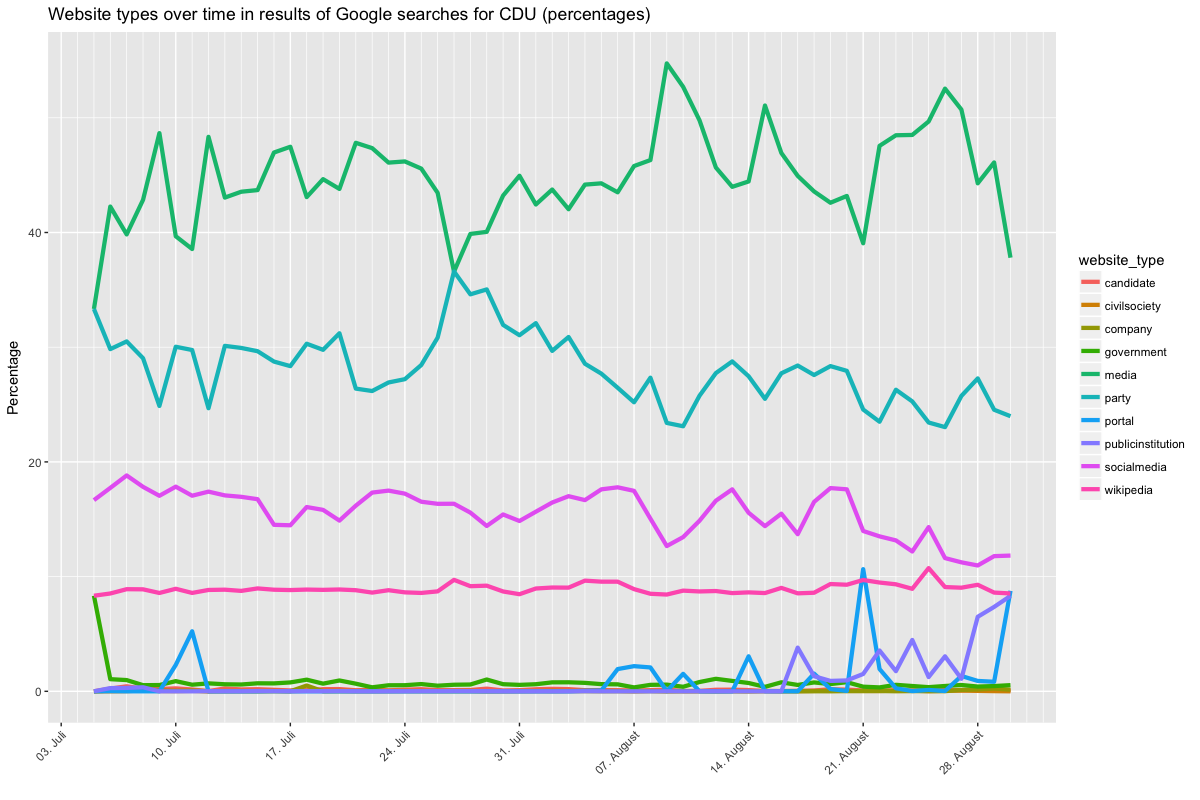
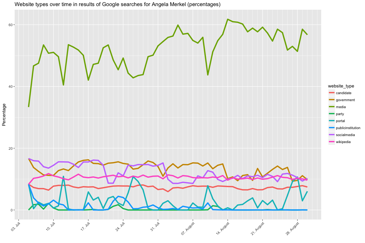
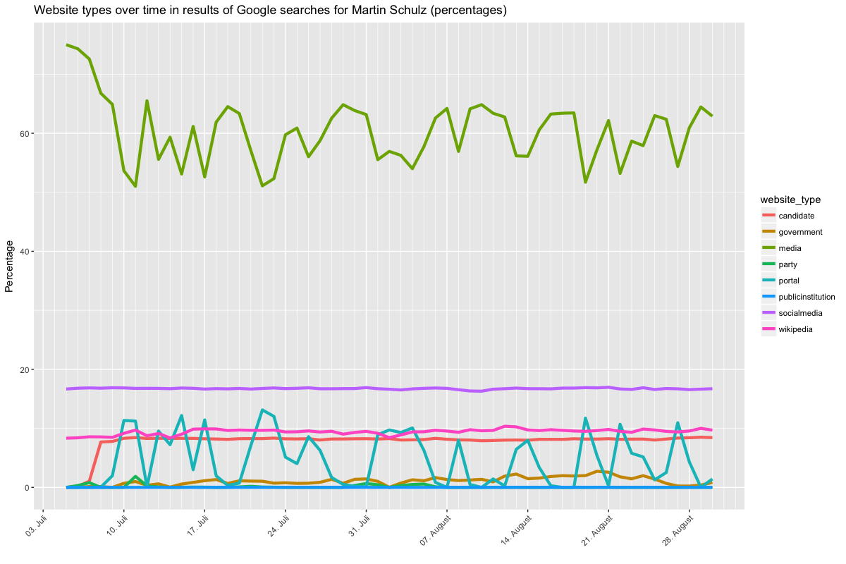
I won’t go into too much detail here, but it appears that the relationship between media and party results is generally of the nature described above, i.e. you are more likely to see a party website on the weekend when there is a relative lack of news, and CDU and SPD appear to differ in relation to how often their social media accounts feature in Google results. For Merkel and Schulz, results also differ. In particular there is more variation for Merkel and even a slight trend of increasing media results as the election date draws nearer, though this may again be just a temporary hitch. The point here is that a proper time series analysis could unearth trends between early July and election day, which could both point to changes in news coverage and to changes in how Google treats these queries. But that’s for another analysis.
How strongly are results personalized when searching for parties and candidates?
Let’s turn to once more to the similarity and difference of search results. In the previous post, I introduced the Jaccard index as a measure of similarity. Two sets of results that are entirely similar have a Jaccard index of 1, while two sets without a single element that occurs in both sets have a Jaccard index of 0. Last time, I directly compared random samples and plotted their similarity as a heatmap. While this was fine for an exploration of the data, this time I want to show a more systematic approach.
I’ll start by defining a default result set that we can compare all other search results to. Below is a table showing all results when searching for Angela Merkel for the entire period under study. The table is sorted by frequency, i.e. the most frequently occuring results are at the top.
angela-merkel.de bild.de bundeskanzlerin.de bundeskanzlerin.de facebook.com faz.net focus.de focus.de heise.de instagram.com spiegel.de wikipedia.org | 104
angela-merkel.de bundeskanzlerin.de bundeskanzlerin.de facebook.com focus.de hdg.de instagram.com spiegel.de spiegel.de welt.de welt.de wikipedia.org | 100
angela-merkel.de bild.de bundeskanzlerin.de bundeskanzlerin.de facebook.com focus.de hdg.de instagram.com spiegel.de spiegel.de welt.de wikipedia.org | 98
angela-merkel.de bundeskanzlerin.de bundeskanzlerin.de epochtimes.de facebook.com focus.de instagram.com n-tv.de spiegel.de t-online.de t-online.de wikipedia.org | 96
Note that these sets do not consist of individual urls, but websites, and that they are not ranked, but sorted alphabetically. The first step is taken to differentiate between spiegel.de and bundeskanzlerin.de, rather than between different individual news stories on spiegel.de or sub-pages of bundeskanzlerin.de, which just makes the results more fragmented. The second step is taken to make it easier to compare result sets, and because we operate under the assumption that the order of results is not important as long as we are looking at the first page.
And here is the bottom of that same table of result sets, i.e. those results that occur only a single time in that particular combination.
angela-merkel.de bild.de bundeskanzlerin.de facebook.com focus.de gamestar.de n-tv.de spiegel.de spiegel.de sueddeutsche.de wikipedia.org zeit.de | 1
angela-merkel.de bundeskanzlerin.de bundeskanzlerin.de facebook.com n-tv.de spiegel.de spiegel.de spiegel.de tagesschau.de wikipedia.org wunderweib.de wunderweib.de | 1
bundeskanzlerin.de cnn.com express.co.uk express.co.uk facebook.com forbes.com spiegel.de stern.de theguardian.com welt.de wikipedia.org wikipedia.org | 1
bild.de bild.de facebook.com focus.de gmx.ch spiegel.de spiegel.de sueddeutsche.de t-online.de welt.de wikipedia.org zeit.de | 1
abc.net.au bbc.com cnn.com cnn.com forbes.com independent.co.uk independent.co.uk spiegel.de telegraph.co.uk theguardian.com twitter.com wikipedia.org | 1
nzz.ch pi-news.net schweizer-illustrierte.ch spiegel.de spiegel.de spiegel.de spiegel.de t-online.de t-online.de welt.de wikipedia.org zeit.de | 1
The differences between the top and the bottom of the table is pretty obvious. While some results reoccur many times (angela-merkel.de, bundeskanzlerin.de, spiegel.de, wikipedia.org) the result sets at the bottom of the table are quite different from those at the top. Some of this is clearly based on language and location. First Google tries to disambiguate what you are searching for (when searching for a common name or acronym), then sources are selected based on language and geography. Disambiguation isn’t an issue for Angela Merkel, but it is a safe bet there are a number of people called Martian Schulz or Christian Lindner, and even more likely that people mean different things when they search for acronyms such as AfD or CSU. Other variation is more difficult to account for. I am especially intrigued by sites such as wunderweib.de(lifestyle), gamestar.de (gaming) and pi-news.net (conspiracy theories) all happily showing up in the top 12 for some users. Clearly these are not based on language or location, but on criteria such as a user’s age, gender or preferences.
So we’ve now established that the result set that occurs most frequently for a particular query is a kind of default. That means we can calculate the Jaccard distance of all other result sets to that one. Voila, we know which results are most distant to the original and can accordingly ask which of the independent variables influences this relative closeness/distance. Note that this is not entirely the same as just tabulating result sets by frequency, which is obviously simpler. Of results from the bottom of the table shown above, some may be much more similar to the default than others (compare #1 with #5).
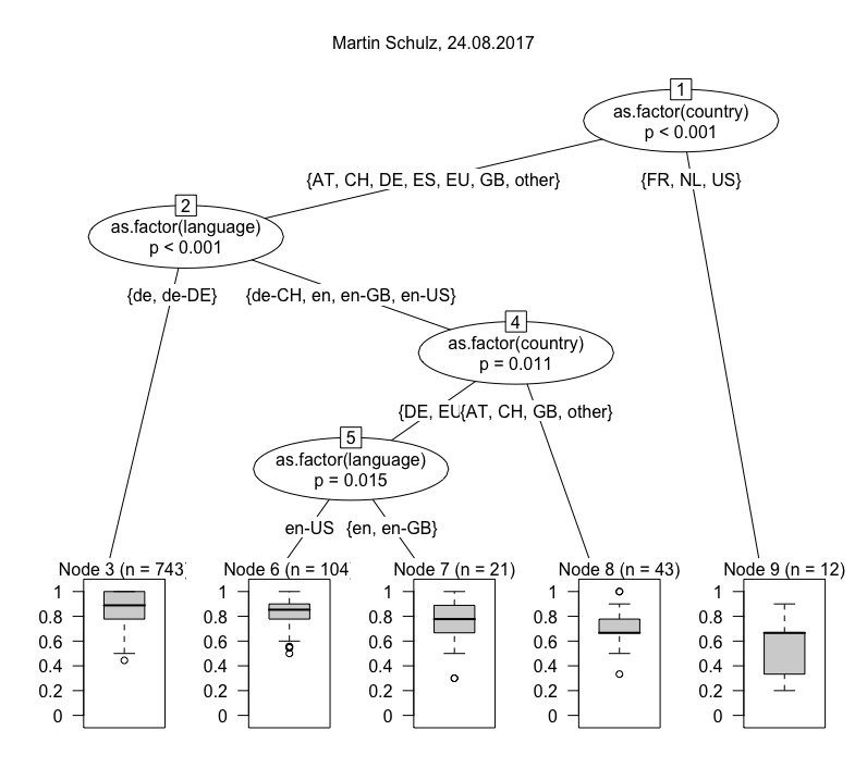
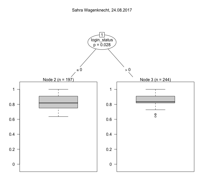
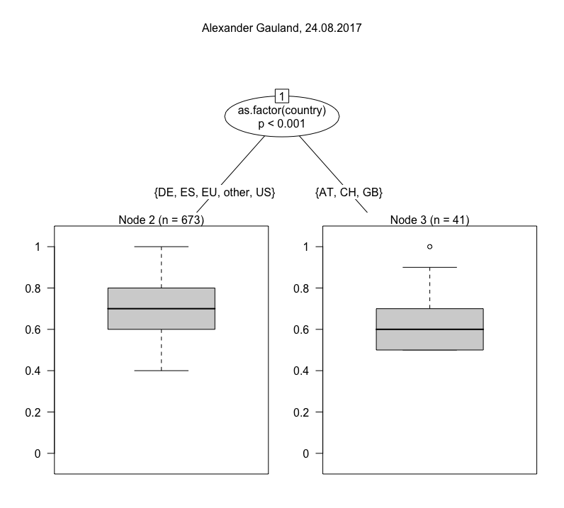
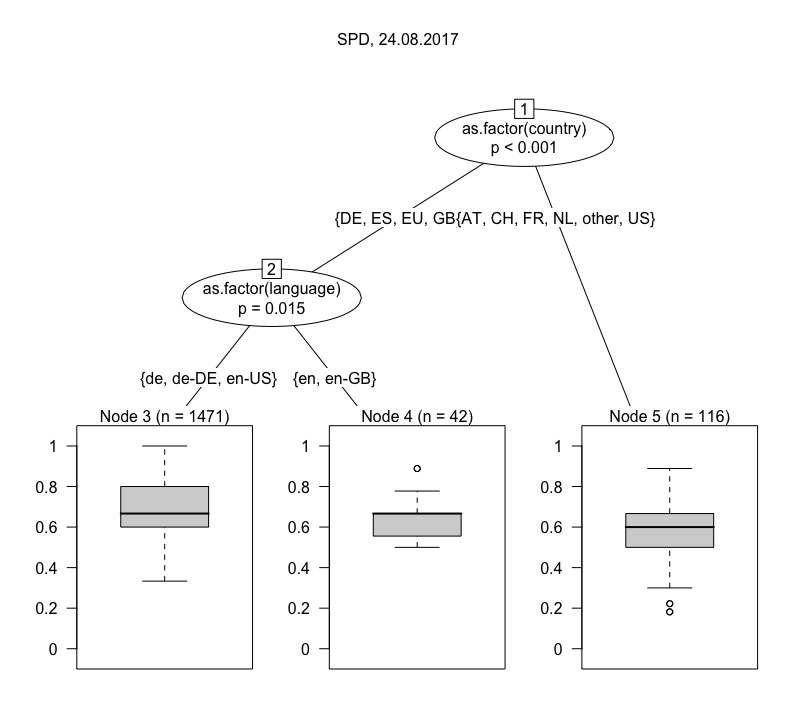
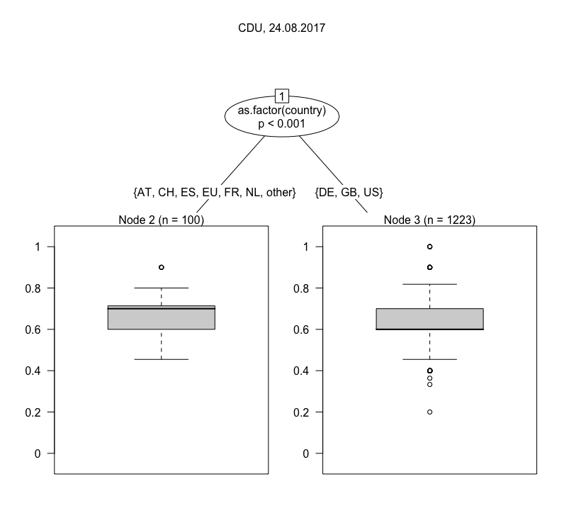
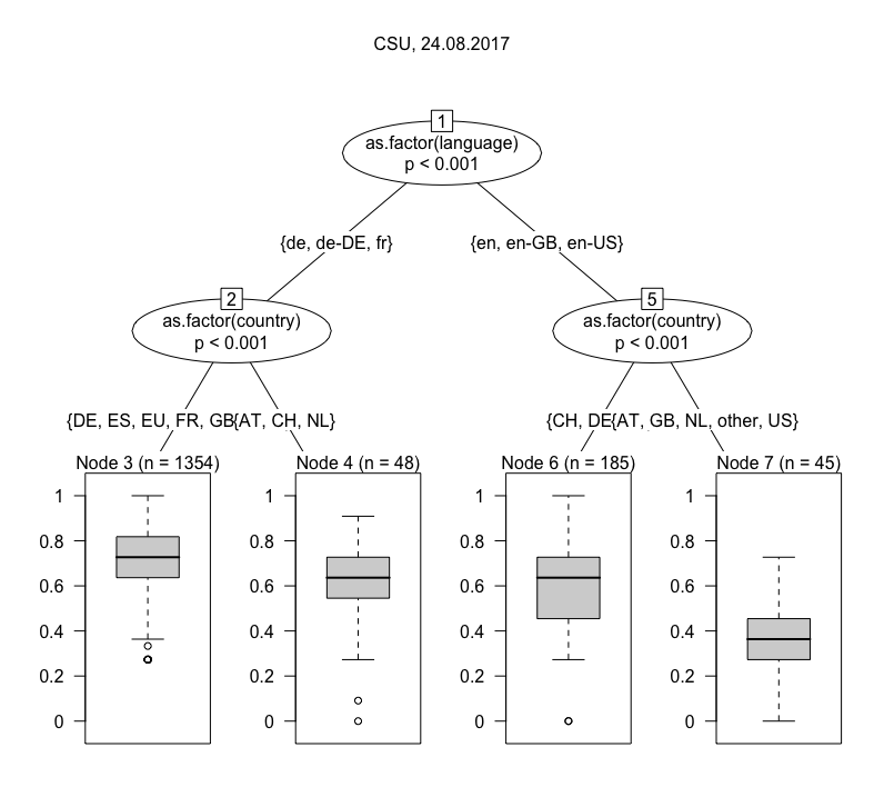
One we have calculated the Jaccard index for all result sets with the default set, we can fit a model. The one I have chosen here is a conditional inference tree (ctree), which is “a non-parametric class of regression trees embedding tree-structured regression models into a well defined theory of conditional inference procedures” (from the accompanying paper). For our purposes it is mostly important that ctree works with a variety of data types (nominal, ordinal and continuous variables) and is non-parametric, i.e. does not require data to be normally distributed. The visualizations below are ctrees for a number of individual queries. They are usually based on a n of ~ 1,000, because they are deliberately not modelled using the full study period, but only a randomly chosen day. This step is taken to avoid purely temporal fluctuations in the results. Below are trees for a number of different search queries (click to enlarge), all from the same day.
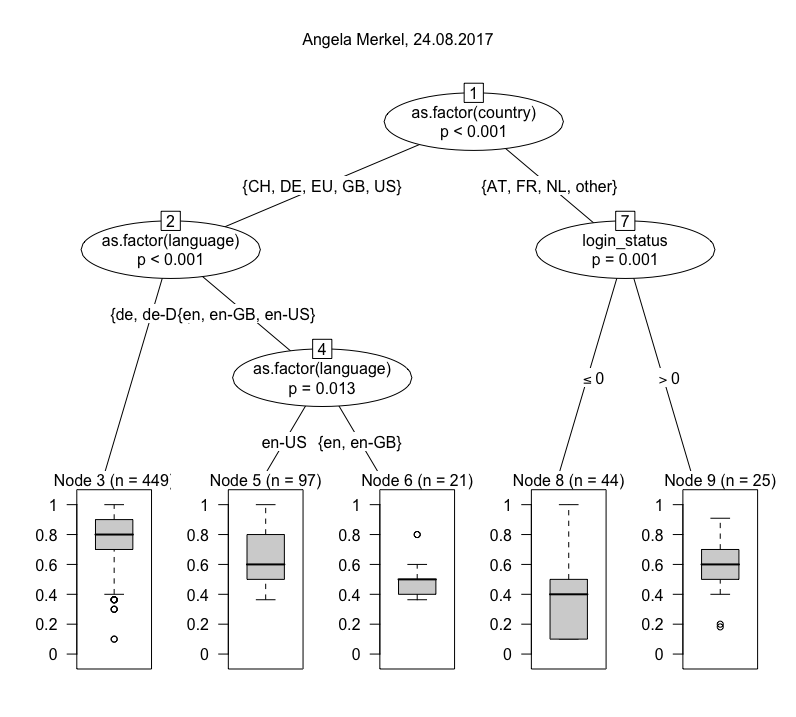
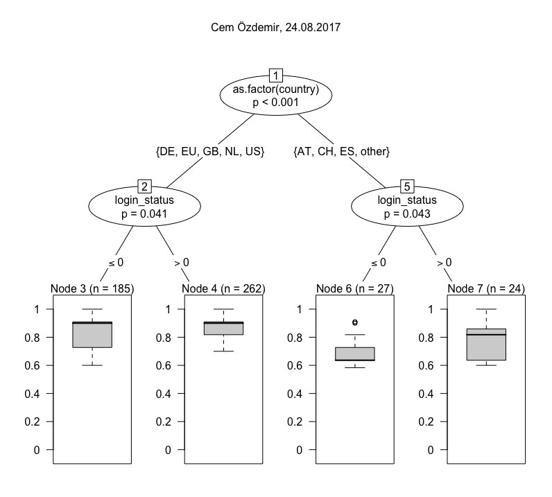
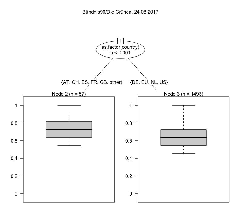
Let’s start at the top. Angela Merkel’s results are pretty interesting. The tree is initially split by location (i.e. country), placing Germany and Switzerland into a cluster with the US and Britain, and all remaining countries in another. The first cluster is subsequently split into German, American English and British English. The other-countries-cluster in the mean time is subdivided by whether users are logged in or not. The splits are qualified with chi square tests as an indicator of confidence. While I wouldn’t overvalue them due to the sample size (if you plot a tree for the whole period, all p-values will drop to < 0.001) they appear plausible as basic indicators of affinity for Google. The boxplots at the bottom show the distribution of Jaccard indices between 0 and 1, meaning how similar this particular cluster of results is to the default. Node 3 — users in Germany with their language set to German — make up the biggest cluster and (unsurprisingly) get the most standard results. What gets me excited are the outliers at the bottom of that plot. More on that in a moment. Nodes 5 and 6 (US and British users) form much smaller but distinct clusters. Why do they still look different? One thing to keep in mind is that Google not only differentiates Germans in Germany from Americans in the U.S., but also Germans in the U.S. (for work, on vacation) from Americans in Germany (for the same reasons). And what about Germans reading English-language news or people with incorrect browser language settings? That last point easily explains the differences in Node 8 and 9 regarding the more standard results for users in other countries who are logged into a Google account. Since Google knows their preferences, it doesn’t have to rely on their location and (given the composition of Datenspende’s sample) most of the are probably German, even those in Vietnam and Venezuela. So what about those outliers are the bottom of Node 3? These are contain sites like wunderweib.de, gamestar.de and pi-news.net and must be based on fairly strong personalization that is not the result of language or location. If you are looking for a filter bubble, it’s there.
The patterns for Martin Schulz, though different in detail, show several strong commonalities if you look at the boxplots. There appears to be an extra Swiss cluster, but this could easily be the result of coverage in the Swiss media on that particular day. On the other hand, there is no differentiation by whether or not users are logged in. In general you’ll notice that the p-values for the logged in variable are usually higher than for the other variables.
By contrast, if you turn to Sahra Wagenknecht and Alexander Gauland, you will notice immediately that there are only two nodes, and that in Wagenknecht’s case the confidence of differentiation is very weak. Both receive much more similar results overall. This is similar in relation to parties, where differentiation is usually quite broad, with the exception of the CSU. What is going on there? To presumed Americans in the U.S., CSU is likely to refer to something other than a political party, most often the California, Colorado or Connecticut State University systems. Hence Node 7’s low Jaccard index in the CSU tree.
I think there is a lot to learn from all this once all the kinks that remain with the methodology have been resolved.
Observations:
- Personalization is only possible if you have a lot of data to personalize. This seems trivial but is quite important. Merkel is more personalized than Wagenknecht because there isn’t enough (substantially different) content for Wagenknecht to pick from. A lack of variety in content means less potential for personalization.
- Personalization is applied hierarchically. It is shallowly applied on the basis of geography and language, and then deeply on the basis of (presumably) browsing history and a sociodemographic and preferential profile that Google has of you.
- With the method shown above, we can filter out shallow personalization much like we can filter out seasonal effects from a time series (****). What remains is deep personalization that is likely to be based on sites that the user has visited in in the past.
- Whether you are logged in or not doesn’t matter a lot as long as there is sufficient data to profile you.
The main take-away for me is that current debates around personalization do not always take factors such as language, geography and time into suffient account, although such factors are much more important than individual user preferences are in shaping personalization. That said, who exactly gets to see strongly divergent search results, why this happens, and what effects it has on those users is an import research question for our field.
Limitations:
- The sample is based on self-selection, limiting its generalizability. This applies especially to the non-German results, which make up a much smaller share of the data. Imagine this with a (more) representative panel of users. We may well encounter very different results in detail, but I think the principle approach would still hold.
- The decisive variables to study deep personalization are probably not in the data set at all, but in the users’ browsing history. All of the outliers visible in the plots must be explicable by that, unless one assumes that Google just randomly shows some people very non-standard results. The beauty of the ctrees is that they show internal deviation within nodes. For example, someone in Node 6 of Angela Merkel’s tree gets very German results, although she shouldn’t, based on what the manifest variables on language and location would predict.
- The clustering needs further validation by comparing days and experimenting with looking at longer periods.
(*) It is also possible that their is a bias regarding our sample here. If there are many Green supporters among the participants in the Datenspende study, perhaps only they would see the many local websites operated by local party branches.
(**) Whether a candidate presents herself on the party’s page or her own website will usually make little difference, of course.
(***) Of course the order is extremely important, but a) operationalizing this is complicated and b) we are not so much interested in what a user will click on but what menu of choices (the first page of results) they are presented with.
(****) This is likely to be complicated in practices, especially because there are bound to be interactions, but the profiles by language and location are likely to hold up in practice, because showing someone a news website they don’t usually read is different from showing them content in a language they don’t understand, or showing them the website of a U.S. university instead of a political party from Bavaria.
Dieser Beitrag spiegelt die Meinung der Autor*innen und weder notwendigerweise noch ausschließlich die Meinung des Institutes wider. Für mehr Informationen zu den Inhalten dieser Beiträge und den assoziierten Forschungsprojekten kontaktieren Sie bitte info@hiig.de

Cornelius Puschmann, Dr.

Jetzt anmelden und die neuesten Blogartikel einmal im Monat per Newsletter erhalten.
Plattform Governance

Kann KI die Demokratie stärken? Ein Datensatz zu KI-Projekten, die demokratische Prozesse unterstützen möchten
Ein Datensatz mit über 98 KI-Projekte mit demokratischem Anspruch dient als Grundlage für mehr Forschung zu KI und Demokratie.

Zwischen Zensurvorwurf und Plattformmacht: Was der Digital Services Act wirklich regelt
Der DSA wird zunehmend als "Zensurgesetz" angegriffen. Dieser Beitrag argumentiert: Im Kern soll das Gesetz die Meinungsfreiheit im digitalen Raum schützen.

Demokratie zum Ankreuzen: Unsere Wahlkabine bei der Langen Nacht der Wissenschaften
Wir haben Berliner*innen eingeladen, ihre Haltungen zu Demokratie in Deutschland zu teilen. Die Ergebnisse erscheinen hier in Kürze.