Making sense of our connected world

Form follows function? Challenging the academic narrative
The internet has fundamentally changed the way researchers work and collaborate, but has had less impact on the way they publish their results. We ask how scientific reports should be designed with the internet as the primary distribution channel in mind. In this article we identify challenges and further propose a framework within the 5th Conference on Computation, Communication, Aesthetics & X in Lissabon.
Academic publishing is changing
Scientific periodicals emerged in the seventeenth century (McDougall-Waters 2015), and to the present day, the design and structure of scientific articles is defined by these early paper-based publications (see Davis 2014). We use bibliographic citations that are related to the ways libraries manage journals and books. And for more precise references, we use page numbers. The scientific world, however, is changing and the first place where researchers look for publications is often no longer a physical library but the internet. While the scientific workflow is increasingly moving online, the way research is presented still follows an analogue logic. So the traditional design for paper-based publications, including page numbers, was transferred to the new environment in form of Postscript or PDF documents. They preserve the established layout but also contain a digital representation of the text.
Along with the way literature is retrieved and accessed, online tools transformed the way researchers communicate, collaborate, and organise their careers. This includes research-specific services like ResearchGate, Mendeley, or LabFolder as well as more generic tools for online editing, collaboration, or communication (see van Noorden 2014 and Perkel 2014). A variety of applications strive to facilitate citing and publishing research results online, yet the design for publications and citations remains the same.
Quantitative data – understandable and visually enhanced
The share of research based on quantitative data is constantly increasing while the scientific community is still struggling to reference data sources appropriately. With citations being the most important currency for a scientific career (Fecher et al. 2015), we have to revise the way we include and cite data in publications. Comprehensive and interactive visualisations further enable researchers to make sense of and present complex data sets, multi-layered dependencies and real-time information.
At the same time the evolving complexity of societal phenomenons, economic systems, and political decisions challenge established practices in journalism. Data journalism and interactive content “is becoming the industry standard” (Rogers 2011). Although infographics are highly popular and find a rapid distribution via social media channels, well-researched and reliable content becomes even more indispensable to advocate transparency in a world of filter-bubbles and populist uprising. The growing complexity and challenge of evaluating the credibility and quality of journalistic content online urges the academia to accelerate their publication processes and provide openly accessible content.
The reader is no longer just a primarily passive actor but an active user in a digitally enhanced user environment.
Disrupting the linear narrative of scientific papers
Most scientific papers are structured along a linear design consisting of research question, methods, results, and discussion. This narrative is completed with an abstract and a list of literature, which the article refers to and an appendix suitable for additional material like small tables rather than for instance larger datasets. However, visualisations and diagrams are non-interactive and limited in complexity. Citations are static and refer to an entry in the bibliography at the end of the document. Tables likewise and most of all limited by the size of the page. Videos, sounds and other multimedia content can only be included by reference to an external service.
Taking a look at practical examples of how research data is transferred in terms of usability, technical interoperability and visualisations within scientific publications, our sobering realisation is once again confirmed: in the classical field of academic publishing, most publications seem to be limited in terms of interactivity and supportive visualisations, also due to scientific rigor. Another reason is, that “in contrast to experts in visual communication, such as graphic designers – science communicators are not generally trained in visual literacy” (Rodríguez Estrada and Davis 2015, 142). User habits and the “visual speak” are oftentimes excluded in the academic publication process (ibid.).
In contrast, data journalism, popular science as well as commercially motivated research activity present numerous projects, that illustrate the growing requirements and complexity of data visualisations. And it comes as no surprise, that science leaps behind other (mainly industry related) fields regarding the popularity of infographics.
Widening the scope: inspirations from public and political institutions
Advantages through visually enhanced information as well as interactive elements are numerous. Especially in the field of public and political institutions as well as popular science exemplary cases successfully transfer complex data sets in (interactive) infographics of high quality.
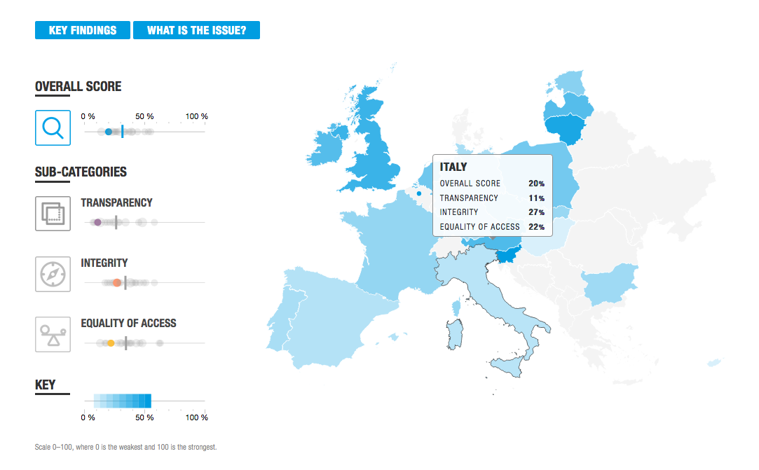
Fig. 1. Transparency International providing an interactive map on lobbying in Europe
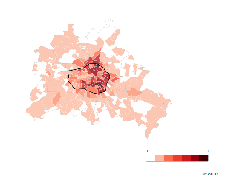
Fig. 2. A university project visualising data about the effects of Airbnb in Berlin
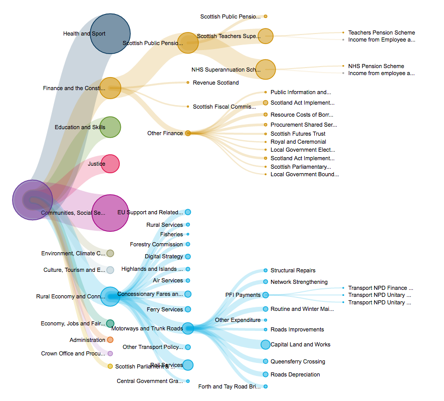
Fig. 3.Scottish Parliament showing the proposed allocation of budget for 2017 and 2018 on various detailed levels.
The examples above illustrate the possibilities to transfer complex information into low-threshold offerings in a mainly non-scientific context. Interactive elements allow readers a user-friendly and playful content perception. The reports show that interactive and user-friendly reports with multiple layers of information as well as access to data sources are feasible. The current implementation of those reports, however, involves a significant amount of manual work, which makes it unrealistic for large-scale use.
How can we foster visually enhanced academic publishing to meet the state-of-the art level of usability and interaction design?
Key questions when transforming the way to publish
To address above mentioned challenges we suggest a framework that lowers the barriers for researchers and journalists to produce both functionally and aesthetically enhanced publications. This enables them to reach audiences beyond their traditional scope through “recontextualisation” of academic content and discourse (Luzón 2013, 428). We identify five areas of challenges, each of which comes with its own set of questions:
Respecting existing research practices
How do we ensure compatibility to existing research and publication practices? First, how do we reference and cite scientific material and second, how do we meet the requirements of scientific careers based on reputation systems?
Increasing the transparency of individual contribution
How do we acknowledge scientific contributions so far? The example of hyper-authorship, as for example in a publication from CERN (Aad et al. 2015) with 5154 authors, questions the traditional idea of authorship. Furthermore a general authorship doesn’t reflect individual contributions to specific parts of the work.
Supporting openness
How does open publishing help researchers and reviewers? Standards by W3C or the Manning Early Access Program suggest to enable readers to access books even before publication. At what stage of the research project is public feedback helpful and how do you design the feedback process to improve the quality of the researcher’s work? Besides supporting the researcher, how can accessible data sources help reviewers to evaluate and verify research results? And how can we make publishing processes more comprehensible through open peer review?
Enhancing collaboration
How can we support collaborative elements of scientific work and research processes?
Digital tools support local research groups as well as globally spread research collaborations in their coworking processes and enable shared infrastructures. How do we need to meet those collaborative structure while reshaping the way of publishing?
Fostering transdisciplinary exchange and science transfer
How can we foster an open and frank discourse between researchers of different disciplines as well as between academia and different stakeholders? How can we increase mutual awareness of relevant issues amongst academia and the private and public sector, politics and the general public? And which are the tools that we need to provide them with?
We draw your attention?
The above raised questions will be addressed within the conference xCoAx in Lissabon from 5th to 7th July (5th Conference on Computation, Communication, Aesthetics & X). Following this, a first prototype of this framework will be discussed in a further post.The proposal is a joint effort by Marcel Hebing from German Institute for Economical Research (DIW), Larissa Wunderlich from Alexander Humboldt Institute for Internet and Society (HIIG), and Julia Ebert from Educational Technology Lab of the German Research Center for Artificial Intelligence (DFKI).
References
Aad, Georges et al. (ATLAS Collaboration, CMS Collaboration). 2015. Physical Review Letters 114 (191803)
Davis, Gerald F. 2014. “Editorial essay: why do we still have journals?”. Administrative Science Quarterly, 59 (2), 193-201.
Fecher, Benedikt, Sascha Friesike, Marcel Hebing, Stephanie Linek, and Armin Sauermann. 2015. “A reputation economy: Results from an empirical survey on academic data sharing.” DIW Discussion Paper 1454
Luzón, María José. 2013. “Public communication of science in blogs: Recontextualizing scientific discourse for a diversified audience.” Written Communication 30 (4), no. 4:428-457. doi: 10.1177/0741088313493610.
McDougall-Waters, Julie, Noah Moxham, and Aileen Fyfe. 2015. “Philosophical Transactions: 350 years of publishing at the Royal Society (1665-2015).” London, UK: The Royal Society.
Van Noorden, Richard. 2014. “Online collaboration: Scientists and the social network.” Nature 512 (7513): 126-129. Harvard
Perkel, Jeffrey M. 2014. “Scientific writing: The online cooperative.” Nature 514 (7520): 127-128. Harvard
Rodríguez Estrada, Fabiola Cristina, and Lloyd Spencer Davis. 2015. “Improving visual communication of science through the incorporation of graphic design theories and practices into science communication.” Science Communication 37 (1): 140-148.
Rogers, Simon. 2011. “Data journalism at the Guardian: what is it and how do we do it.” The Guardian 28, no. 7 (2011): 2011.
This post represents the view of the author and does not necessarily represent the view of the institute itself. For more information about the topics of these articles and associated research projects, please contact info@hiig.de.
This post represents the view of the author and does not necessarily represent the view of the institute itself. For more information about the topics of these articles and associated research projects, please contact info@hiig.de.

Marcel Hebing, Prof. Dr.

Larissa Wunderlich

Julia Ebert

You will receive our latest blog articles once a month in a newsletter.
Open higher education

Between accusations of censorship and platform power: What the Digital Services Act actually regulates
The DSA is increasingly attacked as "censorship law". This article argues: Its core purpose is to protect freedom of expression online.
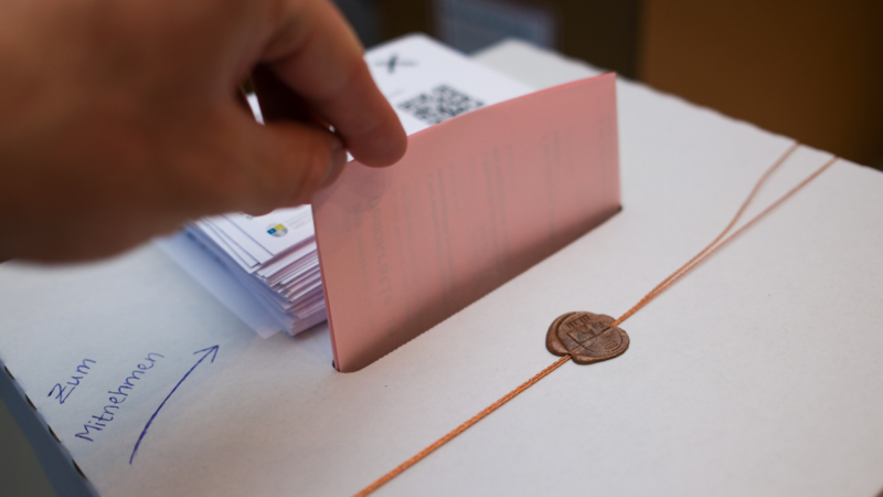
Democracy at the ballot: Results from our voting booth at the Long Night of Sciences
We invited Berliners to share their feelings and opinions about democracy in Germany. The results will be published here soon.
Prompt to perform? Sustainable talent management in the age of generative AI
What impact will generative AI have on talent pipelines? How must companies rethink their talent management?