Unsere vernetzte Welt verstehen

Wie bedeutend sind personalisierte Suchergebnisse im Wahlkampf?
Für viele InternetnutzerInnen sind Suchmaschinen das Tor zur virtuellen Welt. Es ist nicht ungewöhnlich, sich dort über die Politik zu informieren. Doch inwiefern erhalten wir hier dieselben Ergebnisse? Während des Wahlkampfes scheint dies eine besondere Relevanz zu besitzen: Was passiert, wenn BürgerInnen sich auf Google verlassen, um Informationen über politische Parteien und deren Kandidaten zu erhalten?
Katharina Zweig: Analyseergebnisse
The issue
As part of the postdoctoral research network “Algorithmed Public Spheres” at the Hans Bredow Institute for Media Research, we study the outcomes of algorithmic personalization. Ideas such the filter bubble – where we are constantly fed information from websites that we have clicked on in past – are widely discussed. These ideas are also the object of intense academic debate, as research by our fellows demonstrates. I was particularly interested in how these issues play out in political searches: How similar are the results of Google searches for the names of political parties and candidates? What role could personalization play in these differences?
The data
Beginning to answer these questions is normally quite difficult, because we lack access to other individual’s search results. Though we often assume that they are similar to our own, this is anything but certain. And while search engines can be automatically queried, it is difficult to get results that are similar to those obtained by actual users with real browsing histories – in other words, data that is ecologically valid(*). Lucky for us, the lovely people at Algorithm Watch are currently running a crowdsourcing project on this exact issue, called Datenspende BTW17. The project is supported by six “Landesmedienanstalten”, the regulatory authorities for new media in the German federal states of Bavaria (BLM), Berlin-Brandenburg (mabb), Hesse (LPR Hessen), Rhineland-Palatinate (LMK), Saarland (LMS), Saxony (SLM), as well as the University of Kaiserslautern. Through a browser plugin, users donate their search results to the project. The plugin does not collect actual searches of users, but automatically conducts searches for a fixed list of 16 terms. The results are then sent back to AW’s servers. This approach creates a high degree of comparability. If two users with similar browser settings and location search for the same phrase (say “Angela Merkel”) at the same time, shouldn’t they receive identical (or at least very similar) results? Thankfully, Algorithm Watch makes public the anonymized search results that users collect to answer questions like this one.
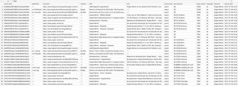
So far, close to 4,000 contributors to the experiment have donated the results of over 2 million queries. The number of individual search results is considerably higher, since each query returns 12 (search) and 20 (news) results; the equivalent of the first page of results. Each result contains thirteen variables (see below).
To answer these questions, we examined a fairly restrictive subset of the overall data. We included only results returned by Google Search, rather than Google News, published between July 5th and July 20th. This still includes a considerable number of news sources, as these also shows up in Google Search as ‘Top Stories’ (see the screenshot below). We only included results with the language setting “de” or “de-DE”, ignoring other languages (including Swiss German). We also only included results where the location was given as “DE”, in some (but not all) cases followed by the exact postal code. Furthermore, we removed some results that we believe to be duplicates, which were likely generated through the data collection process. Finally, for the analysis below we only included the first three results by rank for each individual query. This may seem like a strange choice, but we wanted to stress that even when only looking at this small subset of results, the degree of variation is quite interesting.
In a next step, we split the data into searches by users who were logged into a Google account and those who were not. Having a Google account means that, at least in theory, your results could be more thoroughly personalized, since more information is available to Google when you conduct a search. In practice, many other things can (and are) used to personalize results, including your language, location, type of browser and (most importantly) browser history as stored in various tracking cookies. While the degree to which personalisation is possible is likely to vary a lot, it is safe to assume that Google has some indicators of your interests when you make a search.
How personalized are results for users who are logged into a Google account?
To assess the results, we calculated the share of each website (e.g. “wikipedia.org”) for each search query (“Angela Merkel”), differentiating between whether users were logged in or not. Below are the top six results for Angela Merkel, with the total share of that site among the top three results for users who were logged in and the difference for users who were not logged in.
- bundeskanzlerin.de (logged in: 14%, not logged in: -1%)
- spiegel.de (logged in: 13%, not logged in: +2%)
- wikipedia.org (logged in: 11%)
- facebook.com (logged in: 10%)
- focus.de (logged in: 8%, not logged in: +2%)
- instagram.com (logged in: 7%, not logged in: +1%)
Unsurprisingly, Angela Merkel’s official page as head of the German government comes in at first place. By contrast, her page as a parliamentarian and head of the Christian Democratic Union (CDU), angela-merkel.de, comes in at rank # 17 (logged in: 2%, not logged in: 1%). Der Spiegel and Focus are news sources, Facebook and Instagram obviously represent her social media accounts and Wikipedia her bio, though we did not differentiate between German-language Wikipedia and other national Wikipedias here. The picture looks quite similar for her main challenger, Martin Schulz, the main difference being that Instagram is replaced by Twitter and Focus by Frankfurter Allgemeine Zeitung (FAZ), another news site.
- spiegel.de (logged in: 15%, not logged in: +2%)
- welt.de (logged in: 10%, not logged in: +1%)
- facebook.com (logged in: 9%)
- martinschulz.de (logged in: 9%)
- twitter.com (logged in: 8%)
- faz.net (logged in: 8%, not logged in: -1%)
However, Schulz’ own page comes in lower than Merkel’s, in large part because her page as head of the government is so prominent – this popularity is hard to match for an opposition leader. If you are wondering why Der Spiegel is so prominent, this is likely to be in part the result of selection bias. Algorithm Watch recruited the participants in Datenspende BTW17 through spiegel.de, so an outsized share of users in the sample are likely to be spiegel.de readers, to which Google recommends more stories from that source.
What about the difference between users who are logged in and users who are not? The difference does not appear very important if you look only at the results above, but the distinction becomes clearer once you look at the data in more detail. Big sites like Der Spiegel and Focus – but also the candidate’s pages and social media presences – consistently have a larger share of the overall results for users who aren’t logged into Google. This can be explained by a long tail of sites which are only part of the search results of users who are logged in, e.g. users that Google knows more about and can accordingly offer more tailored results.
Here are all the sites for Angela Merkel present in the “logged in sample” but not in the “not logged in” sample:
20minutos.es
abendzeitung-muenchen.de
bernerzeitung.ch
bloomberg.com
buzzfeed.com
bz-berlin.de
cidob.org
dailystar.co.uk
deutsche-wirtschafts-nachrichten.de
deutschlandfunk.de
dw.com
elmundo.es
firstpost.com
fortune.com
ft.com
google(**)
google.com(**)
huffingtonpost.com
independent.co.uk
ksta.de
latimes.com
ln-online.de
msn.com
ndtv.com
nine.com.au
perfil.com
rt.com
rundschau-online.de
slate.com
telegraph.co.uk
thedailybeast.com
thehill.com
thelocal.de
thetimes.co.uk
tichyseinblick.de
vox.com
washingtonexaminer.com
washingtonpost.com
zdf.de
And here is the same for Martin Schulz:
deutsche-wirtschafts-nachrichten.de
golem.de
google(**)
google.com(**)
thelocal.de
waz.de
Why the difference between the two? This is likely to be conditioned both by who searches for Angela Merkel vs. Martin Schulz, and by the availability of content for both candidates that Google can index. Merkel, being the head of the German government, presumably gets a higher volume of international searches, as well as more international coverage. It is important to note that these are users with the language set to German and who, according to their geo-data, are in Germany. Google must know that they still prefer English- (or Spanish-, Polish-….) language content. Whether users searching for Martin Schulz are (on average) less likely to be polyglots, or there is a lower volume of international coverage is hard to tell, though a combination of both may be the case. Other opposition candidates show similar patterns. Another aspect is the share of specialized news sources. I won’t go into detail, but Golem and DWN for Schulz are unusual (for different reasons), as are RT and Tichys Einblick for Merkel. While the percentages for these are small, one should remember that N is equivalent to the portion of the German population using Google to search for political issues, which is potentially quite large.
You can download an Excel spreadsheet with the data here.
How similar are results for the same query in general?
While this is all well and good, how about a more systematic comparison of search results? How similar are they, and what could their similarity (or difference) be based on? To investigate this, we introduce a simple measure of similarity (S) based on the Jaccard similarity coefficient of two search results. S has a value of between 0 (results are completely different) and 1 (results are completely identical) for any given two searches. We can calculate S for a random sample of results and compare their similarity(***). When doing this, it makes sense to compare results where a number of variables are controlled for, e.g. where
- the search term
- the language setting
- the country
- the date and time
are all kept constant. This may seem odd at first glance, but an important source of variation is due to, for lack of a better term, I’ll call “surface personalization”. Surface personalization is applied based on a set of fairly obvious signals, such as those listed above. By contrast, deep personalization is based on a set of (more) latent signals, presumably based on browsing history and information associated with your Google account. A lot of surface personalization is there to disambiguate polysemous search terms. In the context of our data this includes the assumption that CSU stands for Christian Social Union in Bavaria and not for Colorado State University (or a number of other U.S. schools), and that SPD refers to the Social Democratic Party of Germany, rather than a design school in Italy or a band of Power Rangers. Google no doubt makes this basic decision based on language and location settings. Another variable is time; searchers for candidates and party are highly time sensitive and when plotting S for a sample drawn from the entire 20 day period under study, the resulting clusters clearly represented different days. Obviously, the search term is highly predictive of the result similarity; searching for two totally different things (“Angela Merkel” vs. “Martin Schulz”) gives you different results (duh). But what happens if all these things, including the hour, are kept constant? Below are visualization that show S for 50 random results drawn from the sixteen queries. All results were collected on 13th July at 2pm, with the language set to German and the location set to Germany. The darker the color, the closer the result is to 1 (exact match). You’ll notice a dark blue line going from the upper left to the lower right – that is the similarity of each result with itself (which, obviously, is perfect). The colors left and right of this line look exactly alike, because there is no difference between the similarity of result X with result Y and the similarity of result Y with result X (meaning the matrix is symmetrical). Results are arranged based on their similarity.
Parties

SPD

CDU

CSU

FDP

Bündnis 90/DIE GRÜNEN

DIE LINKE

AFD
Candidates

Bartsch

Gauland

Göring-Eckardt

Lindner

Weidel

Wagenknecht

Schulz

Özdemir

Merkel
What does it all mean? First of all you might notice dark rectangles consisting of several results. These are search results which are identical. While there is a lot of variation by just a single result, that is hardly surprising. The SPD and FDP in particular seem to have large clusters of results which are quite similar, with some outliers in the upper left corner. What’s going on there? A bit as with the coverage of Angela Merkel, English-language sources impact the makeup of the results: English-language Wikipedia and major English news sources stand out from the other results. As above, this is simply because a few users in the sample, in spite of their browser language and location, are interested in English-language news.
Another source of variation across the spectrum is due in particular to local party branches. People in a given area will be shown party or candidate pages for their constituency – which makes sense – or in some cases with another constituency with which Google infers a tie (in one case, a user whose location is Stuttgart is shown a bunch of local party sites in Duisburg, 430 km away). For most parties, there are hundreds of these pages, and Google is very good at including then in the top search results for users based on their (assumed) preferences. There is one exception to this: the AfD. Here the number of websites is considerably lower, while the number of local party Facebook pages is a lot higher.
Filter bubbles may be very small, but they do seem to exist
Does the evidence provided above allow any inferences about filter bubbles? As Katharina Zweig notes in her analysis, overall results are quite similar. Location seems to be the main source of variation, especially for party names, as Google tries to show users party websites relevant to where they presumably live. That seems benign enough. But there are exceptions. The small quadrant of personalized results in the upper left corner frequently contains sources which would be surprising to the mainstream audience, either because the results don’t appear to be particularly relevant, or because Google appears to to think that a particular user is interested in more information (perhaps better put in quotes here) from (for example): Deutsche Wirtschaftsnachrichten (Martin Schulz, Angela Merkel), Bundesdeutsche Zeitung (Alexander Gauland), RT (Sahra Wagenknecht), Sputnik (Die Linke) and Junge Freiheit (Katrin Göring-Eckardt). Overall, Epoch Times has a total share of 0.7% of all search results (Tichys Einblick: 0.3%, Junge Freiheit 0.2%), but on the other hand Wikipedia ‘only’ has 8.7%, because search results are meant to consist of a variety of sources. Further down that list there is some content that would qualify as fake news (in the original non-Trumpian sense), such as an alternative “feminism-free” version of Wikipedia. Approximately 1-3% of users in the sample get these ‘very different’ results when searching for the query terms. Perhaps less headline-grabbing than fake news in this regard is special interest and lifestyle media, which is featured heavily in personalized results. I think we need more research on the relevance of these sources for political communication.
Does that mean that people believe everything that they read online, or that their political opinions are formed exclusively through Google? Of course not. All it means is that if you want to read news from non-traditional sources, Google will help you find it. The real story is that some of these sites (and the variety is immense) aren’t hidden away in the dark recesses of the Internet, but show up right at the top of the search results, where all you and I see are mainstream news sources.
Next steps
The next steps for this kind of analysis is to infer whether there exists a systematic relationship of variables such as location or logged-in-ness to the similarity of results. It is likely that things aren’t really that simple and that the reasons why two users get similar “non-mainstream” results are not straightforward, but result from hidden variables. There are also many caveats when analyzing the data, from time as an intervening variable to our inability to distinguish between users(****). But as this first step illustrates, it is possible to assess personalization in search results to better understand how other people see the (online) world through Google.
(*) It should be noted that because the sample is based on self-recruitment, limitations apply.
(**) Because these URLs can be tied to a Google account, they are not reproduced in full in the data set to preserve the users’ privacy.
(***) Note that we use S to compare n results within one sample to each other, which is slightly different from how it is applied here.
(****) This is only true for the public data set, not for the one maintained by Algorithm Watch, but not shared for privacy reasons.
Dieser Beitrag spiegelt die Meinung der Autorinnen und Autoren und weder notwendigerweise noch ausschließlich die Meinung des Institutes wider. Für mehr Informationen zu den Inhalten dieser Beiträge und den assoziierten Forschungsprojekten kontaktieren Sie bitte info@hiig.de

Cornelius Puschmann, Dr.

Forschungsthemen im Fokus

Data Governance
HIIG Monthly Digest
Jetzt anmelden und die neuesten Blogartikel gesammelt per Newsletter erhalten.

Making Sense of Future(s): Zukunftsbilder der Digitalisierung
Kann Zukunftsforschung den Status quo über den akademischen Bereich hinaus herausfordern und öffentlichen Dialog als Imaginationsfläche kollektiver Anstrengungen betrachten?

Digitalisierung erkunden: Indigene Perspektiven aus Puno, Peru
Was sind indigene Perspektiven der Digitalisierung? Die Quechuas in Peru zeigen Offenheit für die Anforderungen an das Wachstum ihrer digitalen Wirtschaft.

Diamond OA: Für eine bunte, digitale Publikationslandschaft
Der Blogpost macht auf neue finanzielle Fallstricke in der Open-Access-Transformation aufmerksam und schlägt eine gemeinschaftliche Finanzierungsstruktur für Diamond OA in Deutschland vor.