Unsere vernetzte Welt verstehen

Daten, Information, Interaktion. Online Veröffentlichungen als Mehrebenenmodell
Der Artikel präsentiert den Prototyp der kürzlich erschienenen Online Studie “Kooperationen zwischen Startups und Mittelstand” des Alexander von Humboldt Institut für Internet und Gesellschaft (HIIG). Mit einem Appell an eine neue akademische Narrative begegnen wir der Frage, wie Design und Erzählstruktur wissenschaftlicher Veröffentlichungen mit dem Internet als zentrales Veröffentlichungsmedium gestaltet werden können.
Publikation lesen: Kooperationen zwischen Startups und Mittelstand
From resources to narration – building on a multi-layer concept
Traditional publications follow a linear design of storytelling (see figure 1). In the case of scientific papers the structure is specified by the research question, outlined methods applied, presented results and the concluding discussion. An abstract, list of references and an appendix complete the narrative of scientific papers. When paper-based publications were transformed into the form of Postscript or PDF documents, this established design has been preserved. The core narrative of the article which we describe as information layer represents this traditional design.
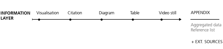
Fig. 1. Elements within the traditional linear design of narration
Our multi-level approach expands the linear structure of printed publications by two new layers (see figure 2):
The interactive layer includes multimedia objects as well as interactive and animated elements, such as videos, interactive visualisations, or sortable tables. The data layer enables authors to reference their particular sources directly. This can be supplementary metadata or data resources; for example entire datasets, source codes, citation details, or copyright information. The integration of code and raw data allows the reproducibility of an article and its results. Moreover, the code behind visualisations serves as a valuable tool for co-researchers.
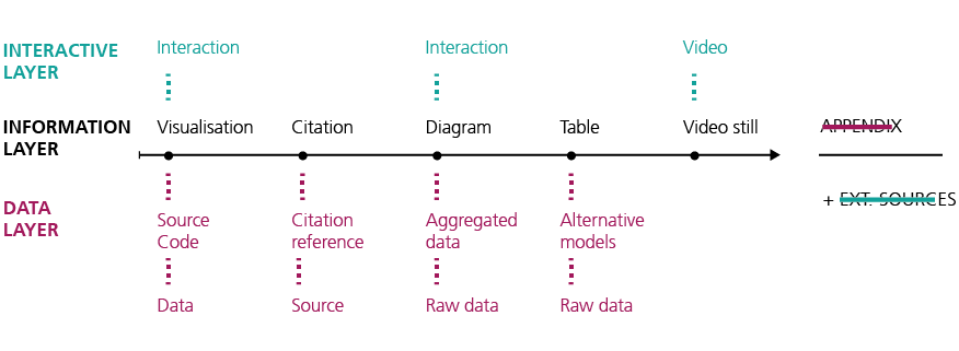
Fig. 2. Our proposal for a narrative providing means of interaction and in-depth material
In addition to above referenced interactive elements and in-depth materials, the information itself can be presented on different layers, suitable for various target groups. This approach enables authors to provide publications with various levels of complexity to address different information needs. This may be, for example, glossary entries, explanations and further links, discipline-specific details or just as well a simplified summary (see figure 3).
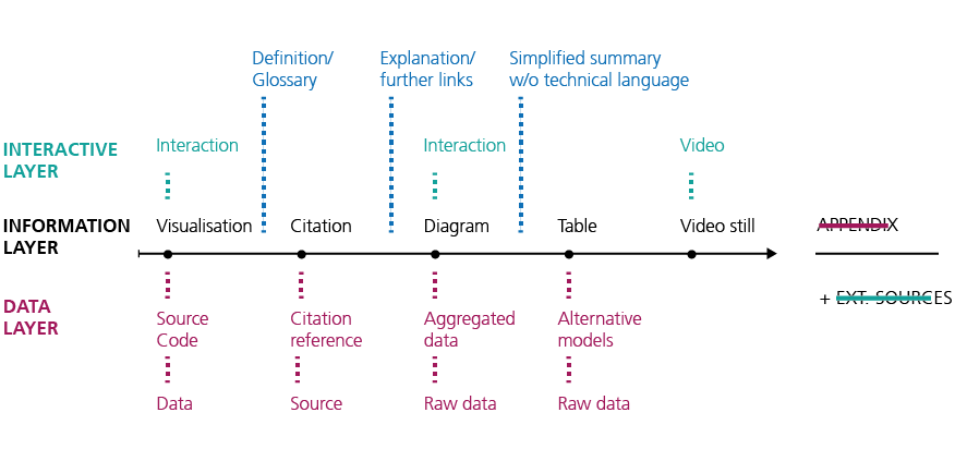
Fig. 3. Adding an extra content layer with auxiliary elements (for specific target groups)
Facing challenges in scholarly communication
Against the background of a “lack of identification of the target audiences” (Rodríguez Estrada & Davis, 2015, p. 146) in science communication and “refining of the visual elements for them” (ibid.) the overall concept addresses main deficits in science communication. Oftentimes “visual material is treated as an optional add-on ingredient instead of being an integrated part of the whole” (ibid.). However, advantages through visually enhanced information as well as interactive elements are numerous. While “infographics” are seen as one of the main tools for science communication (Frankel & DePace, 2012), interactive elements can offer a “serendipitous value” (Melo & Carvalhais, 2016, p. 40) for the reader encountering new, unexpected information.
Reaching new audiences, especially through “recontextualisation” of academic content and discourse (Luzón, 2013, p. 428) is essential. Since “[L]ogical-scientific communication is context-free […] it deals with the understanding of facts that retain their meaning independently from their surrounding units of information” (Dahlstrom, 2014). Rules for recontextualising scientific content no longer primarily apply to the traditional form of scholarly citations but need to be extended for dissemination through social media networks and other communication channels. Units of scientific content – in this case text as well as interactive content – have to work well for citing and sharing so that they can be “presented alone, with little loss of understanding” (ibid.).
Developing and challenging a first prototype
The online version of the study Kooperationen zwischen Startups und Mittelstand presents a first extract of possibilities and a basis for further development. As the title indicates, the study includes strongly practice-oriented content and consequently aims at a wider audience at the interface of the startup community, small and medium-sized enterprises, economy and research. Facing ever shortening attention spans, visually enhanced and low-threshold online content has never been more relevant than today. Based on our concept, graphics can easily be retrieved and displayed, cited practitioners and interviewed persons within videos can be contacted with one click. Decision-makers can access content efficiently and anytime – all features are also available on mobile and touch devices. For the first time in 2016 mobile and tablet devices exceeded desktop internet usage worldwide (StatCounter, 2016).
Five features of the prototype are highlighted below:
Embedded video content
Videos within the text allow a more diverting reception of content without media disruption. In case of an interview, the questions and author information support the video’s insights.
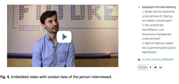
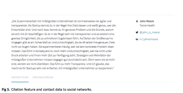
Linked social networks profiles
The possibility to access a full profile and directly contact interviewed experts or researchers via social media profiles is an added value for starting further cooperations or scientific collaboration.
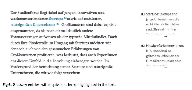
Defining terms on the spot
Clearly defined terms are essential for a sound scientific basis. Glossary elements offer the reader substantial additional content. At the beginning of the report commonly-used terms are explicated, in this case definitions for controversial terms like startups or Mittelstand. An additional glossary explains further relevant terms from the context of the study.
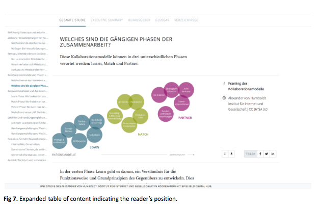
Anytime access to table of content
A table of content which appears with a mouse-over and highlights the current chapter, proves itself as an effective orientation tool. When collapsed, a graphic indicator gives feedback about the reader’s position within the document. This allows orientation of how far the reader has come while reading, comparable to the haptic feedback of a reader’s position within a printed publication.
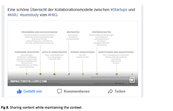
Promoting details via social networks
The study itself as well as all visualisations and videos can be shared via social media networks. A watermarked version of the visualisations hereby preserves the context by stating the author and shortlink to the original publication inside the image.
New perspectives on scientific communication and collaboration
The redesign of academic publications also raises more general questions of how articles are used within scientific communication. Overall, the requirements of users and the practicability of the implementation remain the decisive factors while challenging the academic narrative.
Supporting new ways of publishing while providing compatibility
The integration of videos, animation and dynamic content has found its way to publications of various academic disciplines. Yet we need to provide compatibility with existing publishing standards. With citations still the most important currency for a scientific career (Fecher et al., 2015), the question of how to cite and reference scientific material such as video-based content becomes relevant. As criticism concerning quantitative metrics and journal impact factors is increasing, alternative metrics for impact are experiencing a boom (Franzen, 2015). In comparison to bibliographic metrics, altmetrics extend the spectrum of scientific to non-scientific sources referring to user-based data on the social web. Against the background of technical functionality, the development of further features to support altmetrics to democratise knowledge should be taken into account.
Fostering creativity and open access between science and practice
Open codes of interactive and animated visuals such as those at openprocessing.org encourage creative work. Such snippets can also support researchers in visualising their data resources. Furthermore, providing the code behind scientific visualisations increase transparency of academic hypotheses. Existing implementations can then be understood as a first interpretation rather than a final result.
Yet to come: Individualised interface and user-generated content
The question remains open as to how a user-specific interface might be implemented. A geek mode for instance could focus on data tables and further relevant scientific publications, whereas a granny mode could offer summarising paragraphs, interactive content and definitions for technical terms. Also user-generated content such as comments or reading recommendations could be a valuable addition to the article.
[su_note note_color=“#e6eaea“]
Publications and related projects that grasped our attention:
Membrane by the New York Times R&D Labs. As an experiment of “permeable publishing” it empowers readers to ask a specific questions to the writer.
Smarticles, a new story format of the Guardian which provides readers a smart way to follow ongoing stories on mobile devices. Smarticles break stories up into their main elements to present information in a “series of blocks”.
Snowfall, an innovative storytelling format by the New York Times. The multimedia implementation offers a reportage with audiovisual elements as film, animation and slide-show. Parallax scrolling allows elements of the website to move with different speeds.[/su_note]
The publication framework graphite (presented above) offers the infrastructure as well as the expertise to enhance publications for a multi-media and interactive digital context. The increasing emerging demand for reliable and well-edited information meets a depreciated way of publishing. To bridge this gap graphite offers solutions for each step of the publication process.
References
Dahlstrom, M. F. (2014). Using narratives and storytelling to communicate science with nonexpert audiences. Proceedings of the National Academy of Sciences, 111, 13614-13620.
Fecher, B., Friesike, S., Hebing, M., Linek, S., & Sauermann, A. (2015). A reputation economy: results from an empirical survey on academic data sharing. DIW Discussion Paper 1454
Frankel, F., & DePace, A. H. (2012). Visual strategies: A practical guide to graphics for scientists and engineers. New Haven, CT: Yale University Press.
Franzen, M. (2015). Der Impact Faktor war gestern. SozW Soziale Welt, 66(2), 225-242. doi: 10.5771/0038-6073-2015-2-225
Luzón, M. J. (2013). Public communication of science in blogs: Recontextualizing scientific discourse for a diversified audience. Written Communication, 30(4), 428-457. doi:10.1177/0741088313493610.
Rodríguez Estrada, F. C., & Davis, L. S. (2015). Improving visual communication of science through the incorporation of graphic design theories and practices into science communication. Science Communication, 37(1), 140-148.
StatCounter (2016). Mobile and tablet internet usage exceeds desktop for the first time worldwide. (Retrieved November, 2017)
| Dieser Beitrag spiegelt die Meinung der Autoren und weder notwendigerweise noch ausschließlich die Meinung des Institutes wider. Für mehr Informationen zu den Inhalten dieser Beiträge und den assoziierten Forschungsprojekten kontaktieren Sie bitte info@hiig.de. |
Dieser Beitrag spiegelt die Meinung der Autorinnen und Autoren und weder notwendigerweise noch ausschließlich die Meinung des Institutes wider. Für mehr Informationen zu den Inhalten dieser Beiträge und den assoziierten Forschungsprojekten kontaktieren Sie bitte info@hiig.de

Julia Ebert

Larissa Wunderlich

Marcel Hebing, Prof. Dr.

Jetzt anmelden und die neuesten Blogartikel einmal im Monat per Newsletter erhalten.
Digitale Zukunft der Arbeitswelt

Raus aus dem Digitalisierungsstau: Data Governance bringt Städte und Gemeinden auf die digitale Überholspur
Der Data Governance Wegweiser unterstützt Verwaltungen, digitale Lösungen effektiv umzusetzen.
Netzecho: Reaktionen auf die Tagesschau in Einfacher Sprache
Seit 2024 gibt es die Tagesschau in Einfacher Sprache. Wie wird das neue Nachrichtenformat von Nutzer*innen im Internet diskutiert?

Chancen gegen Einsamkeit: Wie Pflegeeinrichtungen das Quartier vernetzen
Was hilft gegen Einsamkeit im Alter? Pflegeeinrichtungen schaffen neue Räume für Gemeinschaft und digitale Teilhabe.